Lorem ipsum dolor sit amet, consectetur adipiscing elit. Ut elit tellus, luctus nec ullamcorper mattis, pulvinar dapibus leo.
Lorem ipsum dolor sit amet, consectetur adipiscing elit. Ut elit tellus, luctus nec ullamcorper mattis, pulvinar dapibus leo.
Campaign concept
Novosibirsk theatres guide
Objective
Design a visually engaging editorial guide showcasing Novosibirsk’s theatres, using expressive typography, thoughtful layouts and a consistent visual style to highlight the city’s cultural identity and encourage readers to explore its performing arts scene.
Target audience
Local residents interested in arts and culture
Tourists and visitors to Novosibirsk
Theatre enthusiasts
Young adults and students
People looking for cultural experiences and entertainment
Outcome
A visually distinctive theatre guide that combines informative content with experimental typography and engaging editorial layouts. The design demonstrates how typography, visual hierarchy and composition can communicate information clearly while capturing the character of Novosibirsk’s theatre scene.
Deliverables
Print ready 19 pages guide booklet
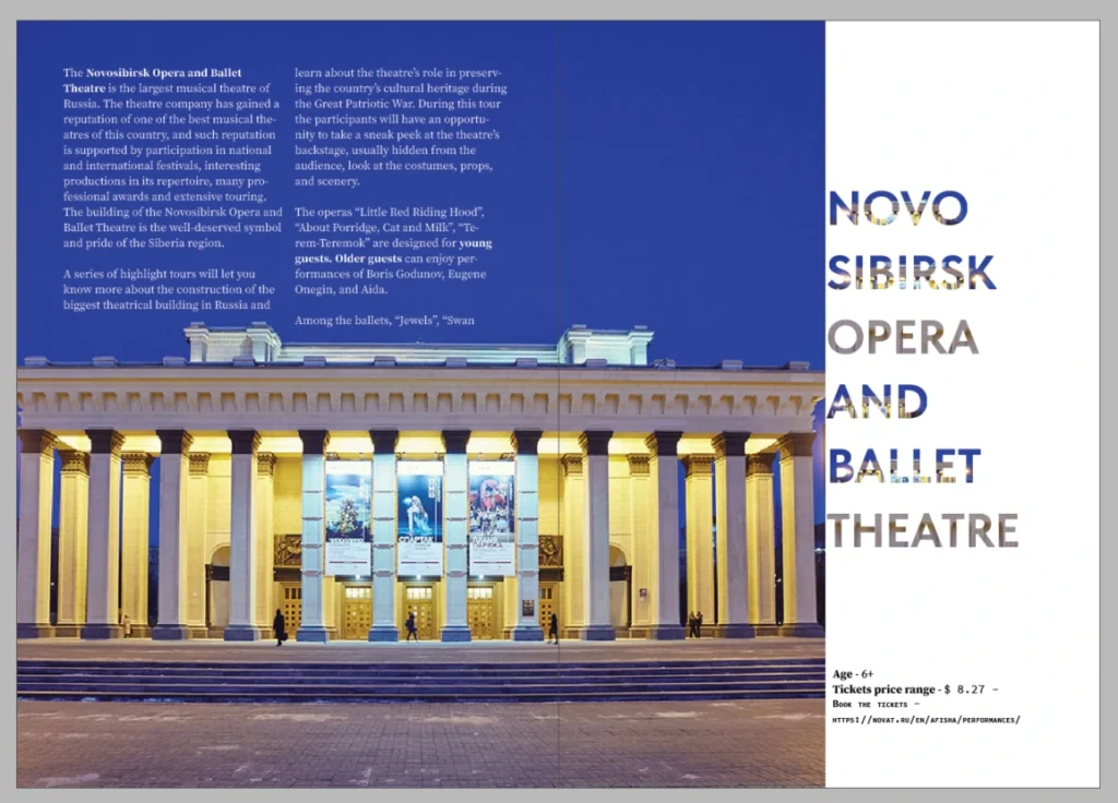
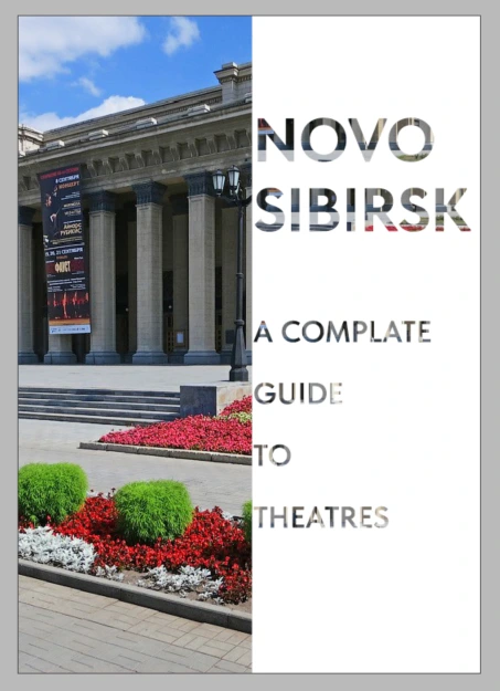
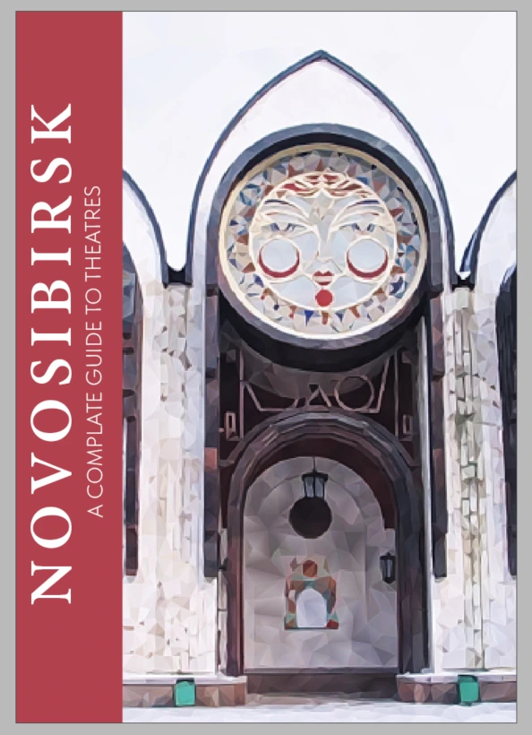
Initial design 1
Header font: Tilda Sans, bold
Body text font: Source Serif Pro, regular
I chose a bold and strong header font in order to use a clipping mask and apply an image to the outlined text.
I used a serif font for the body to differentiate the title from body text.
I used a modular grid for the page layout as it has more freedom for a spread layout. But in the end, I didn’t choose this design as I have more text to work with.
Also, the front page and spread look very similar to other variant, and I want more variety in layout.
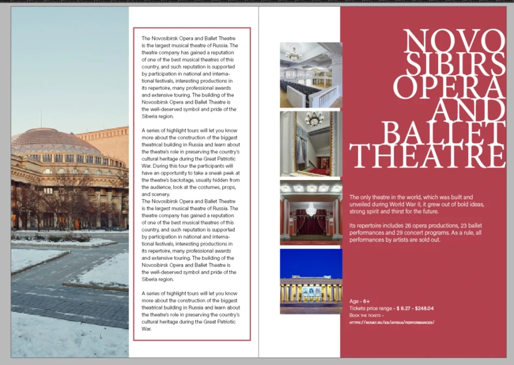
Initial design 2
Header font: Minion Pro, regular
Body text font: Acumin Pro, extra light
I chose an elegant serif font for the header as I was testing the Diabetic Leaving article title.
This layout design was my second choice, but at the end, I didn’t go with this design. I don’t think this layout design will work, as I had a large amount of text to work with, even though the name of the theatre stands out quite well.
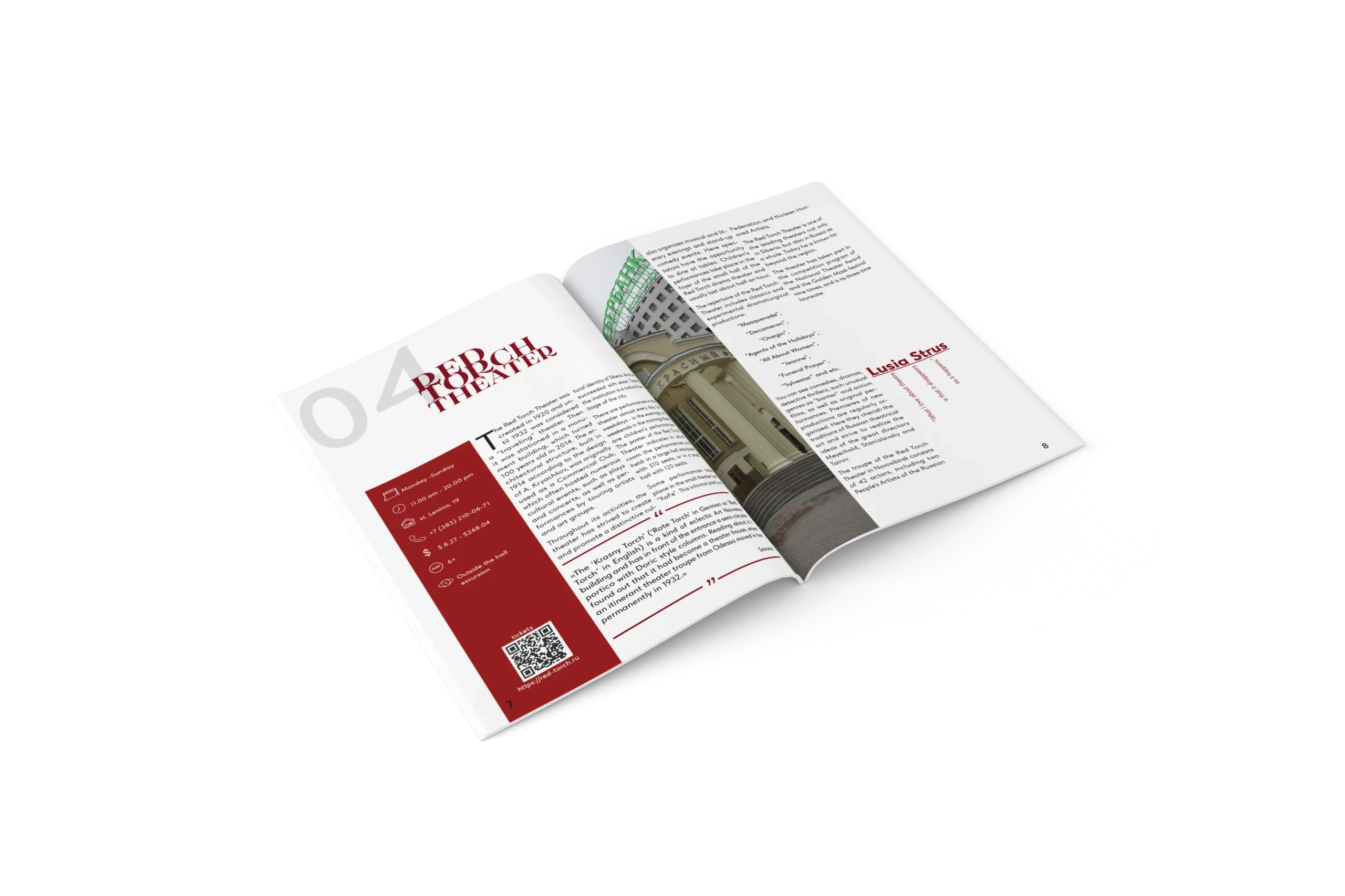
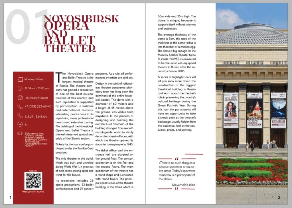
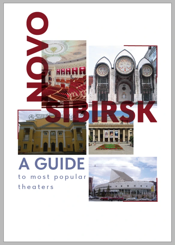
Initial design 3 – final choice
Header font: Tilda Sans. Bold and Tenez, bold
Body text font: Tilda Sans VF, regular
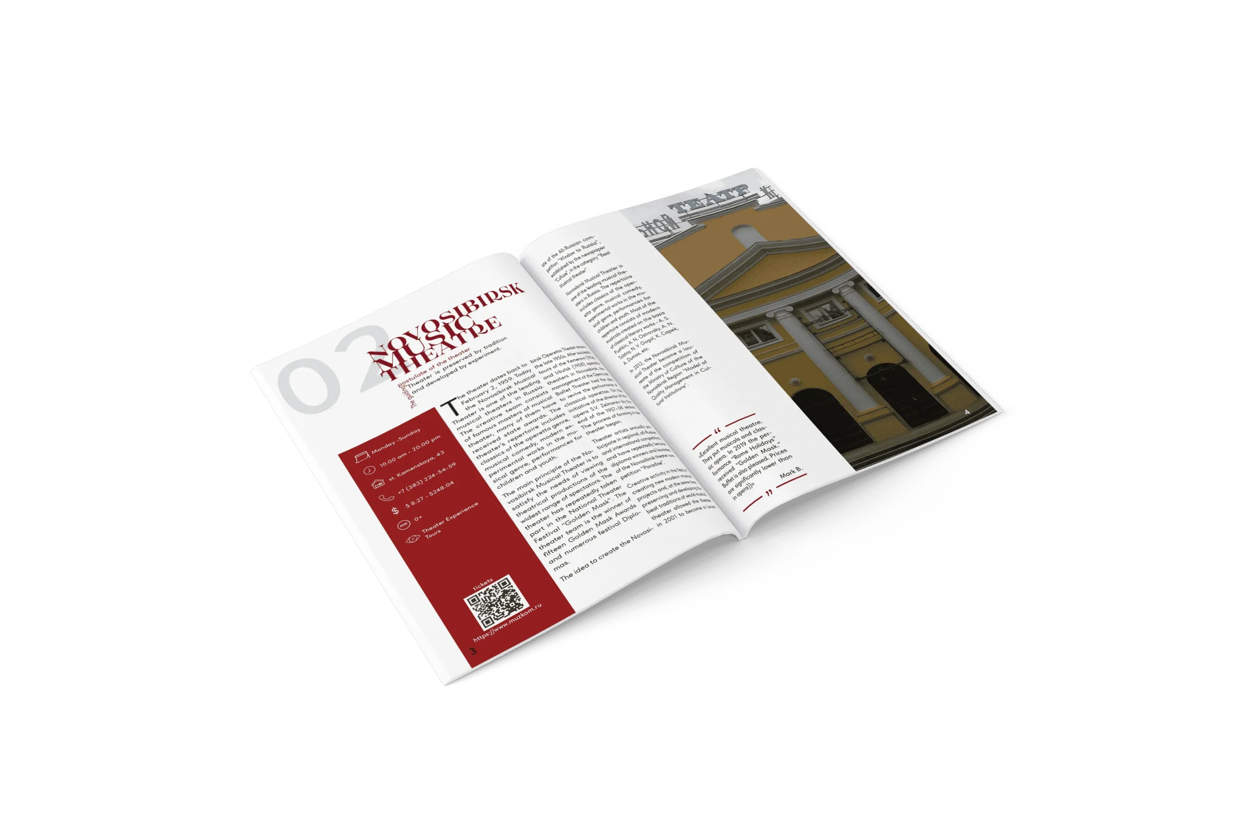
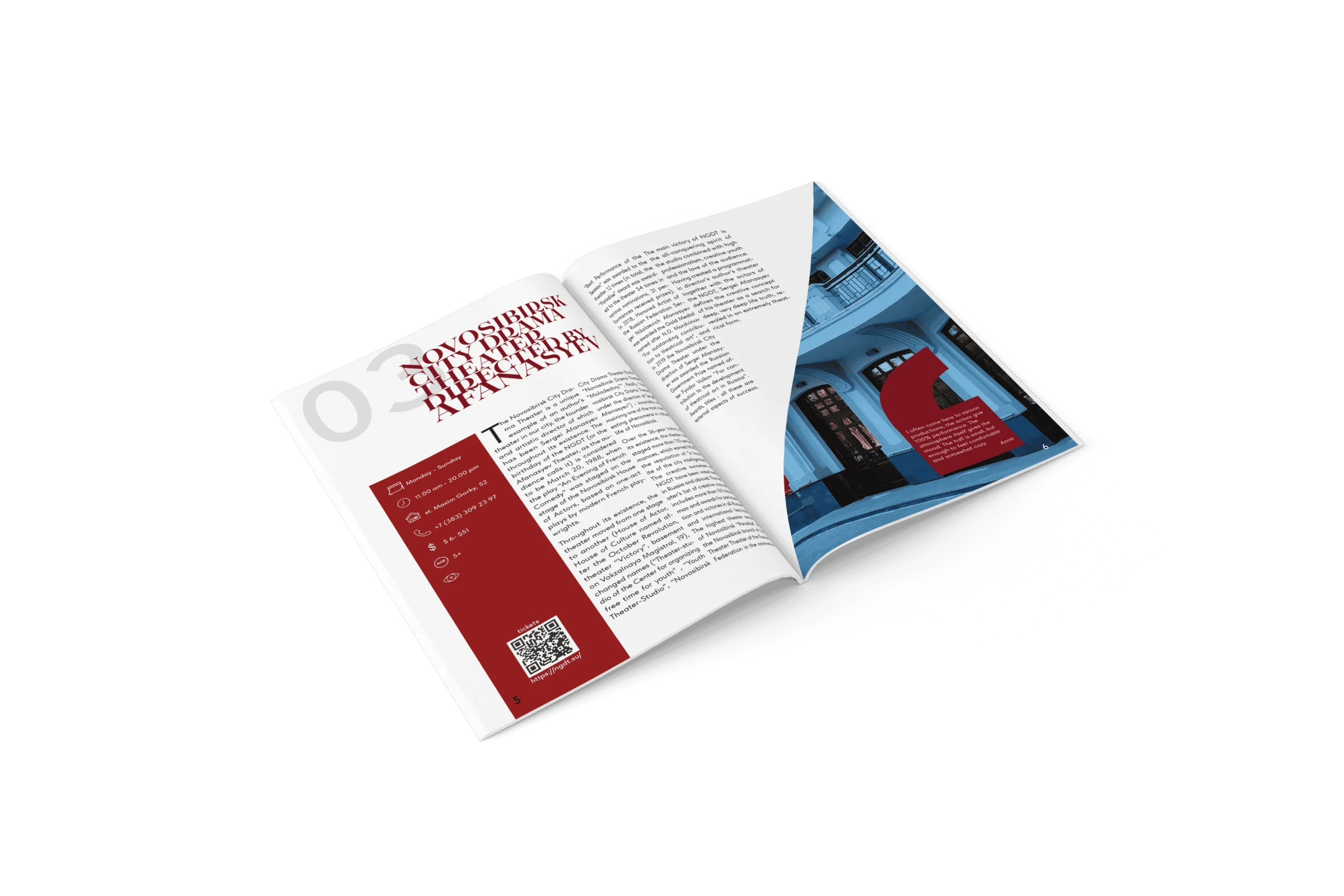
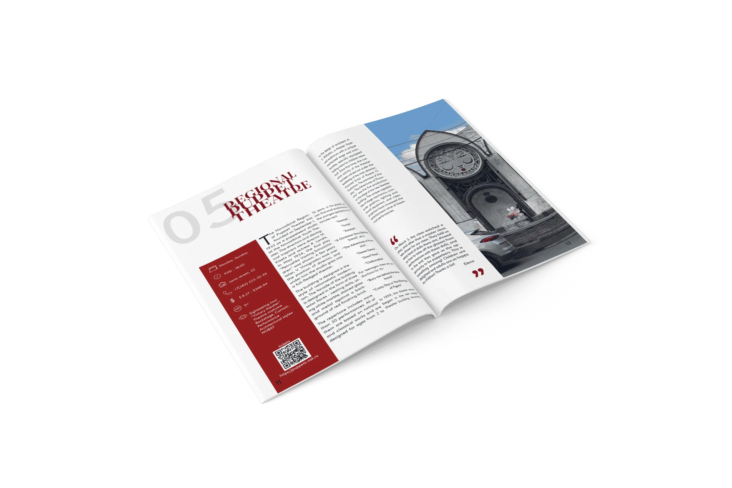
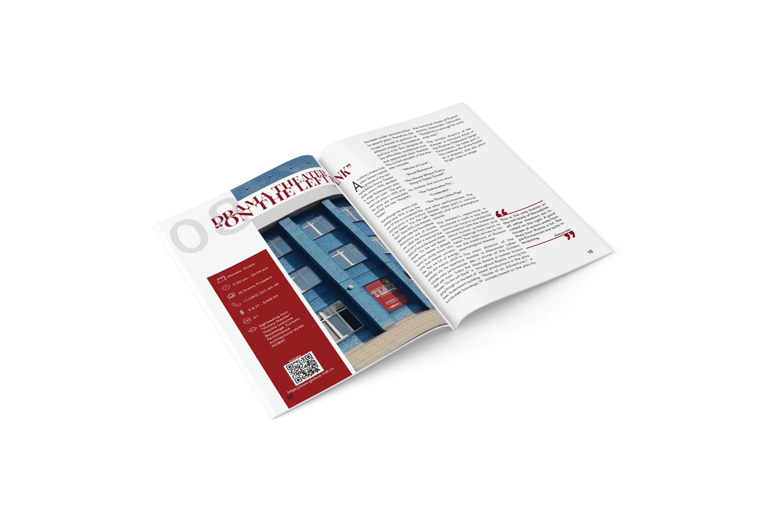
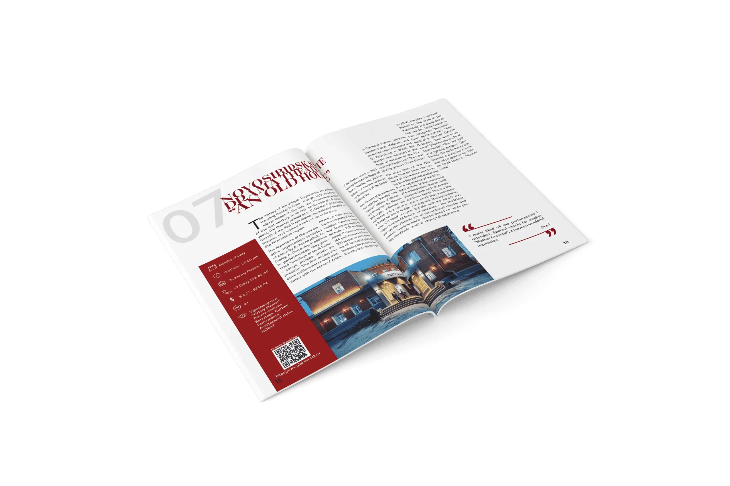
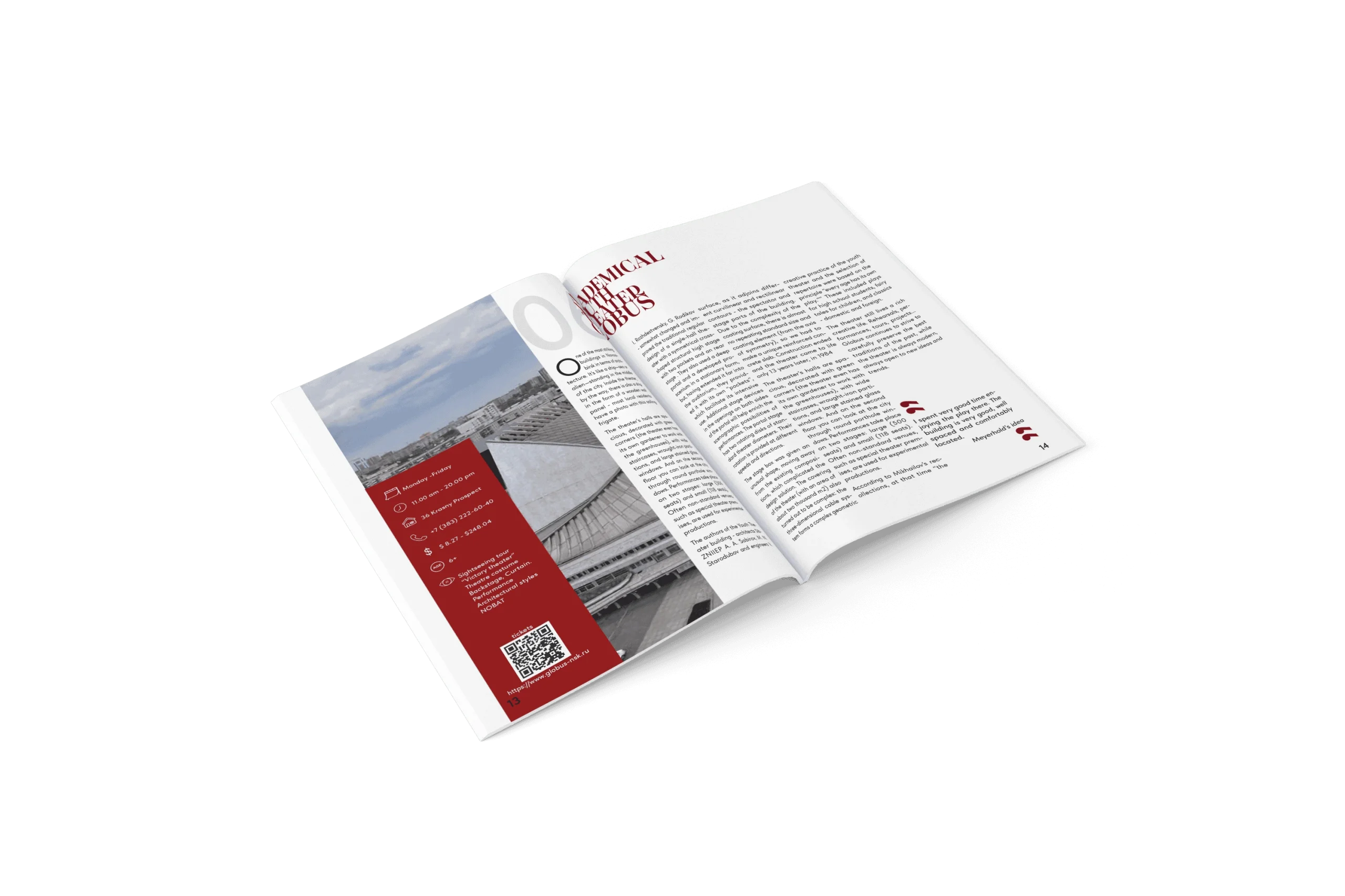
I chose a bold sans-serif font for the front page header and a bold serif font for other titles (theatres).
I like and chose this concept as my final choice. It suits the purpose of the booklet, is easy to read, and looks modern, inspiring and unique. I experimented with the modern layout of the front page.
The font pairing works well for the purpose of the guide.
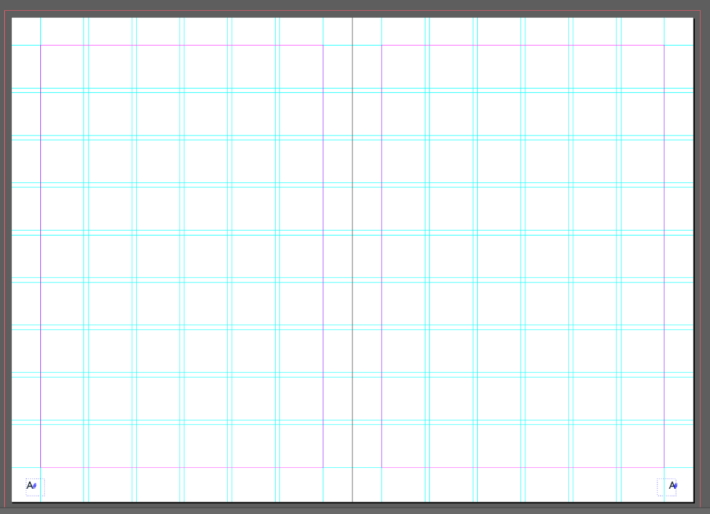
Parent Pages: I created 6 x 9 modular grids and page numbers in Parent Page A, with 3 mm margins and a 2 mm margin between the columns and rows.
Also, the following was set up and checked to achieve the desired outcome:
Paragraph style set up
Pages set up
Layers set up
Character style set up
Hierarchy
Preflight checked
Rivers, widows and orphans checked and fixed
Font pairing
I choose Tilda Sans black font for the cover title as it is modern, bold and attract reader attention.
Heading, subheading
Tilda Sans bold font but smaller size for heading of cover page as it is same style as cover title and follow the same syle.
Theaters title
Tenez bold font for theatres heading, content pageheading, as that font is serif, more decorative and plesent to the eyes and reflects the booklet topic.