Create a clear and minimal layout that ensures instant understanding and usability, even within the limited space of a zero-area screen.
Leverage contrasting colors and images to draw attention to critical UI elements, making interaction seamless and reducing cognitive load.
Enhance user experience by implementing a design that supports intuitive navigation and high readability.
Maintain brand consistency by aligning design elements with the overall brand guidelines.
Deliverables:
High-fidelity, pixel-perfect design using Poppins font and the chosen color palette.
Responsive design adaptations to ensure consistency across different screen sizes.
Fully annotated design files (Figma/Sketch) prepared for developer handoff.
Exportable assets (SVGs, PNGs) for use in development.
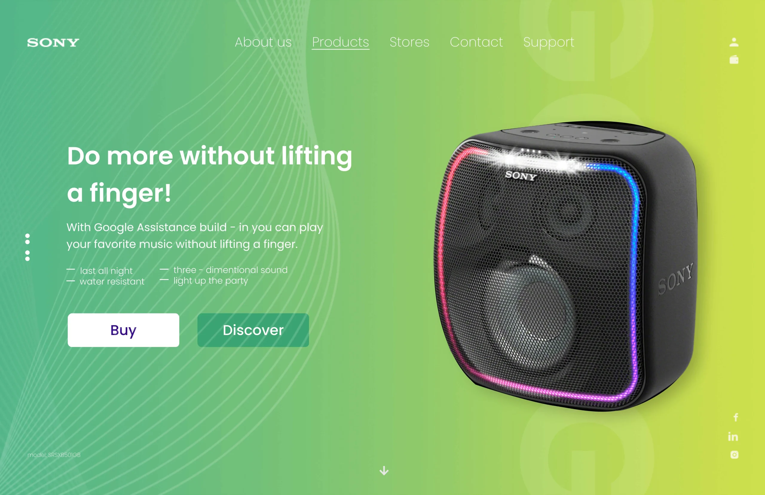
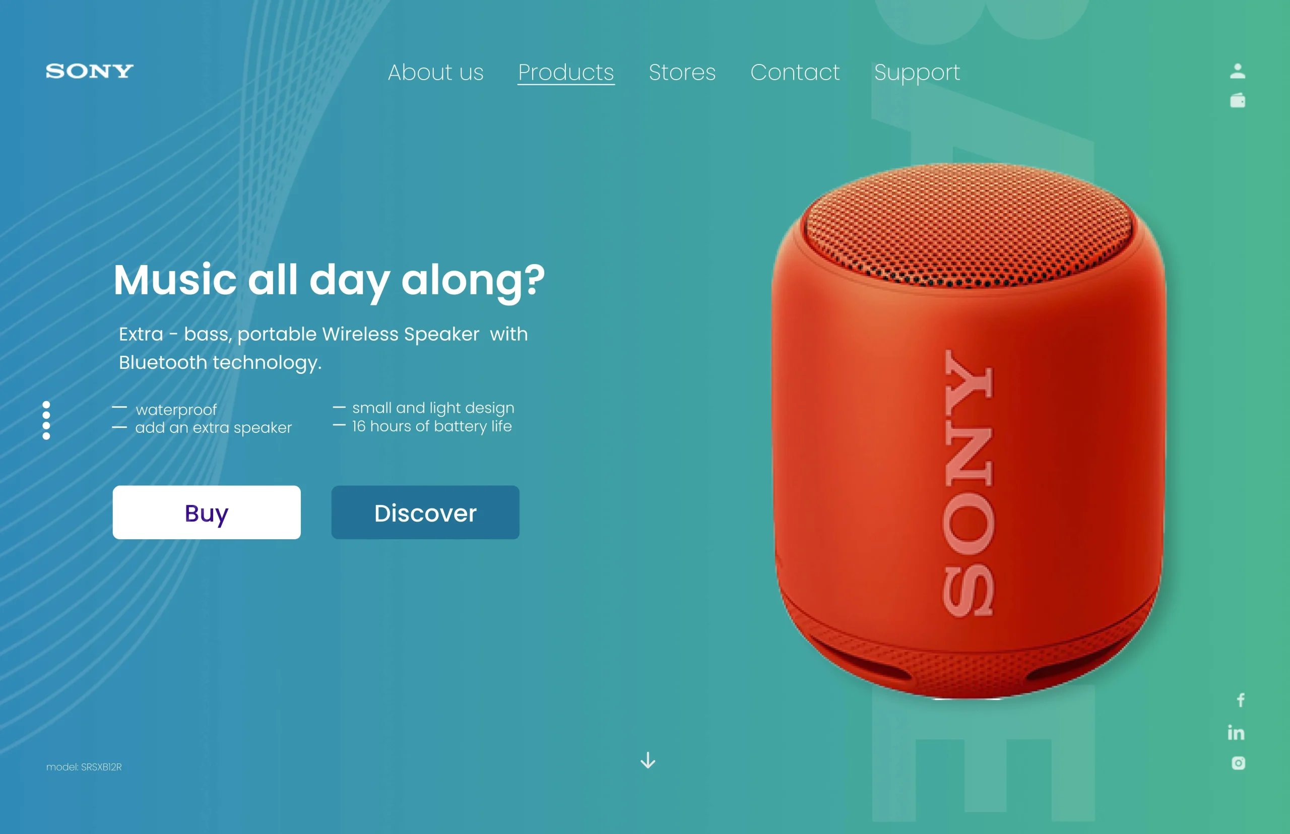
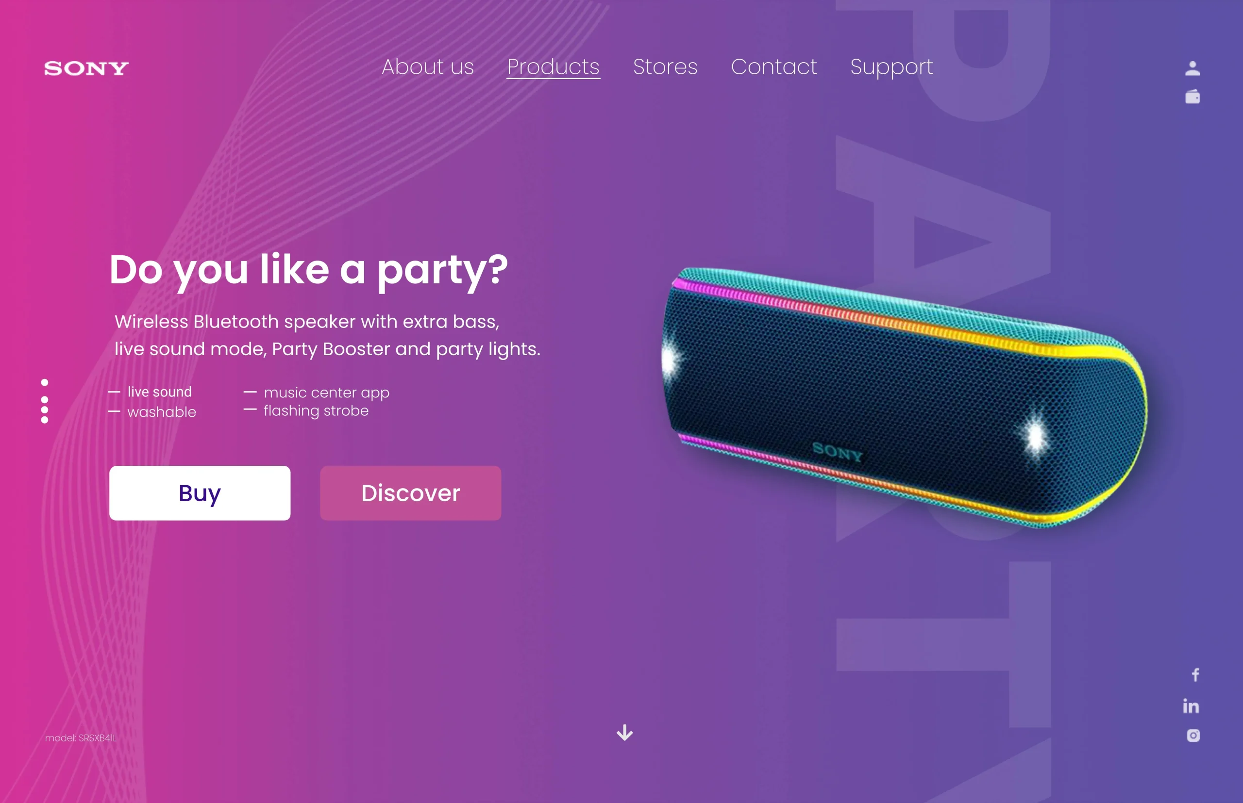
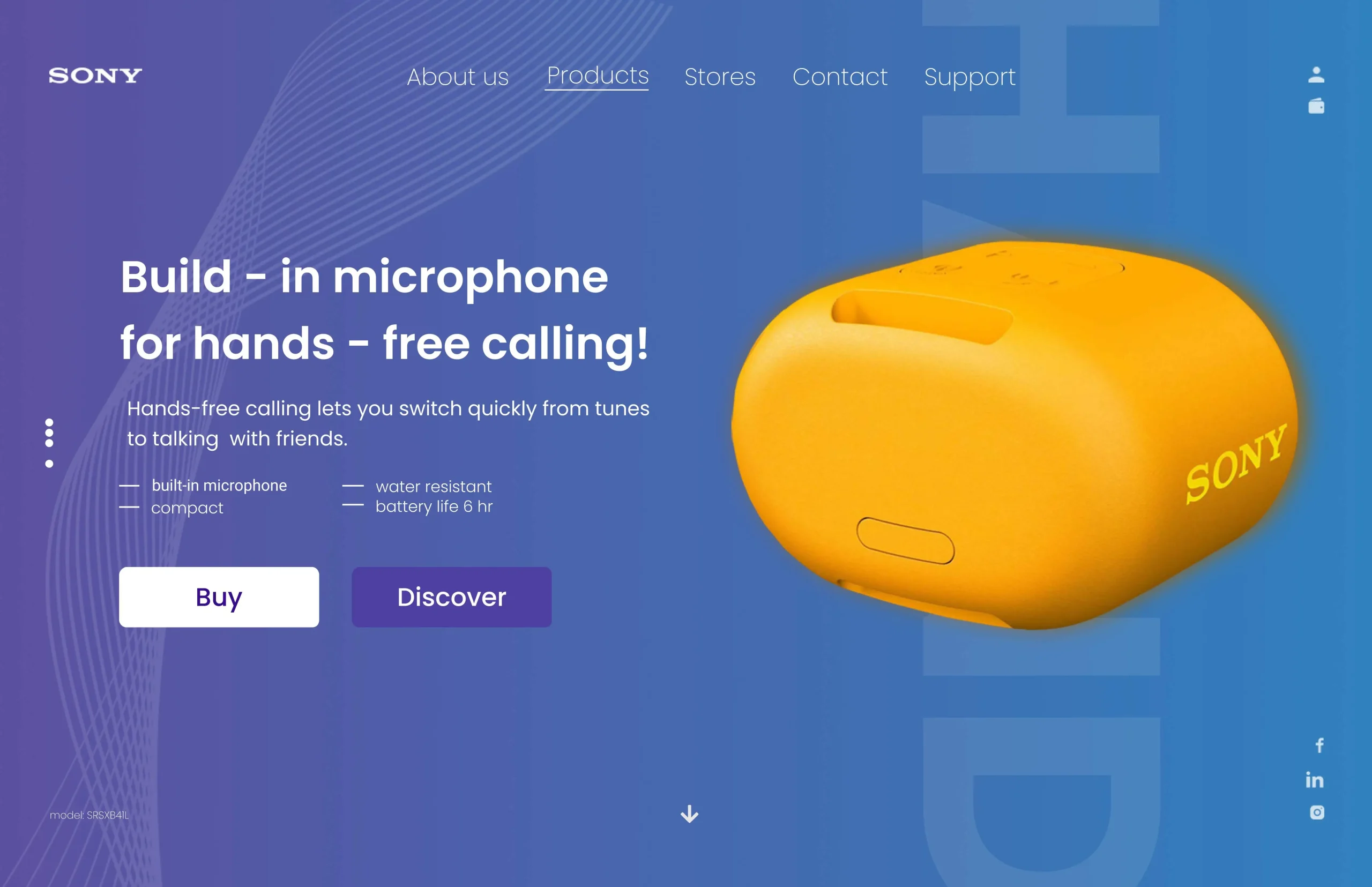
Poppins was selected due to its modern, geometric sans-serif style, ensuring clarity and legibility even at smaller screen sizes.
Contrast Colors & Spacing: Leveraged color contrast (e.g., dark text on light backgrounds or vice versa) to separate content layers. White space was used generously to enhance clarity.