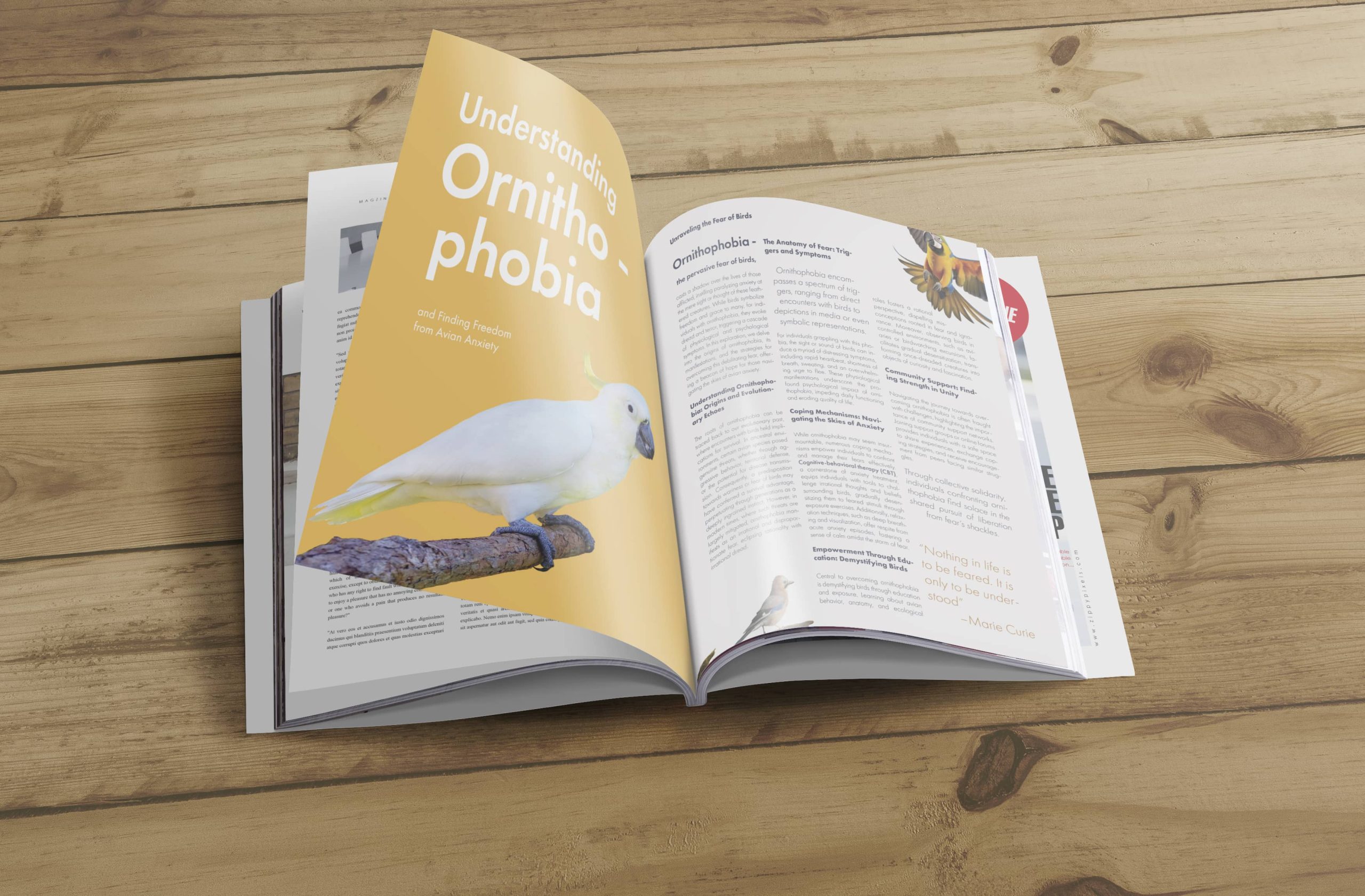
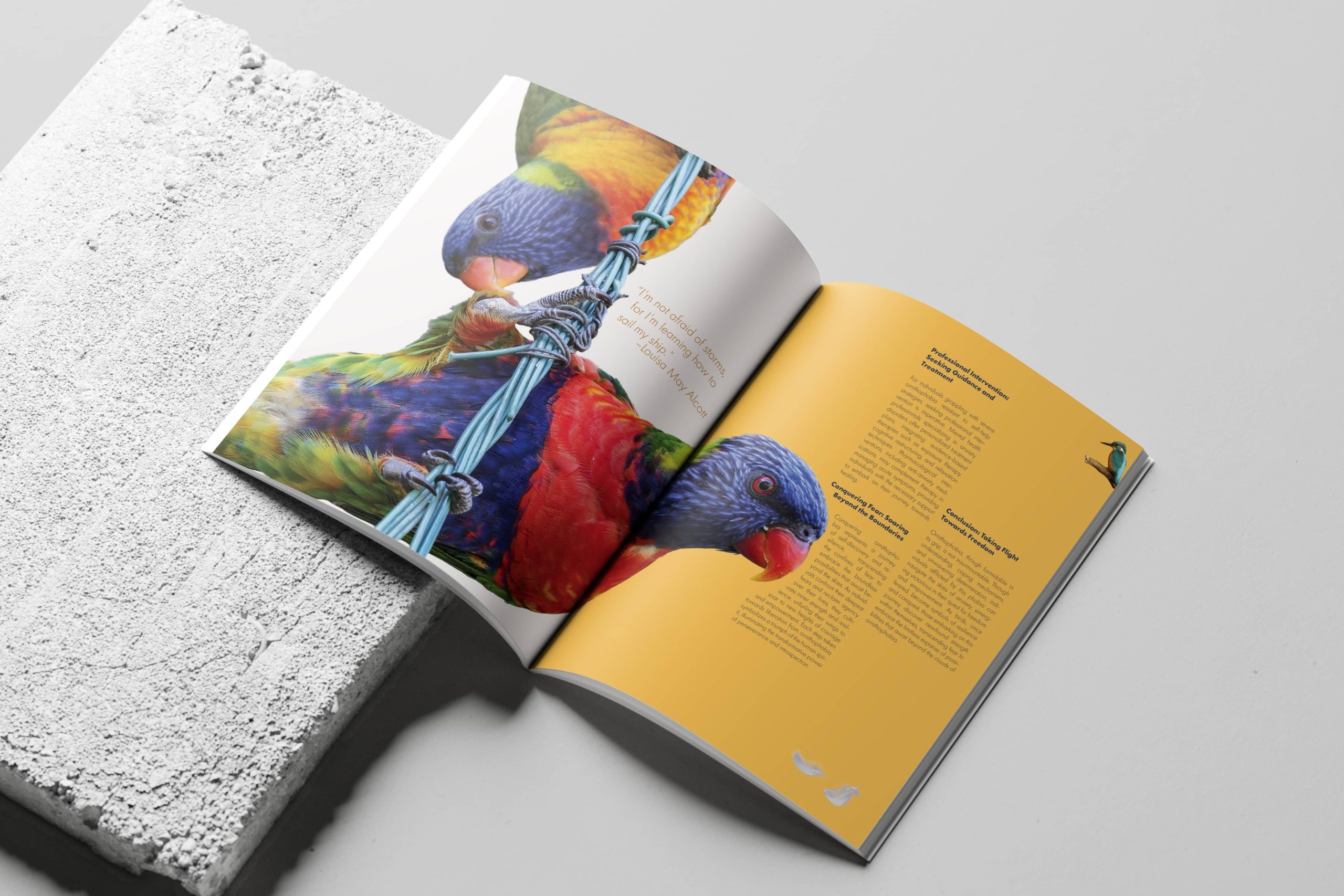
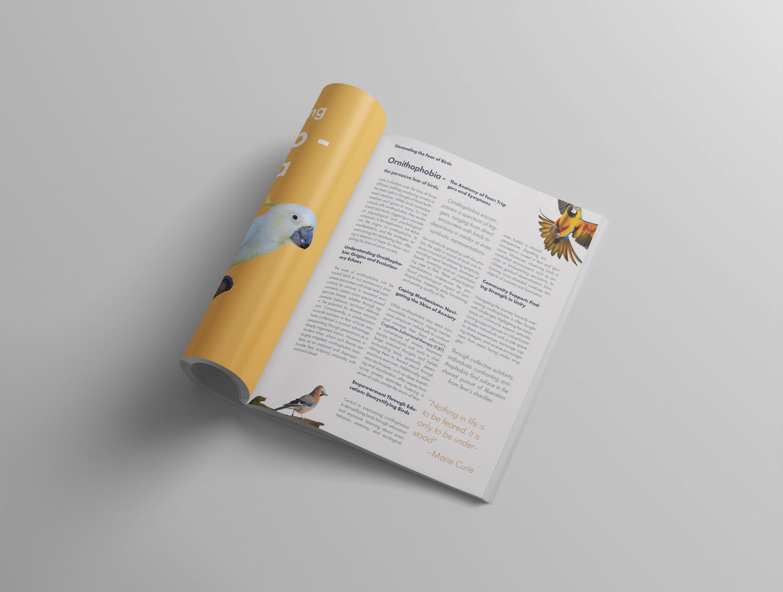
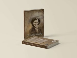
Editorial design
To design an editorial spread that introduces and explains ornithophobia (the fear of birds) in a calm, structured, and visually supportive way.
This project combines content sensitivity with a clean editorial style. From color palette to typographic choices, every element was selected to reduce the intensity of the topic and help the reader feel safe and curious, rather than overwhelmed.
Color: Warm yellow background for optimism and clarity
Typography: Modern sans-serif with clear hierarchy
Imagery: Strategically placed birds—from calm to vivid—to illustrate emotional transition
Layout: Three-column editorial grid, alternating rhythm between copy and visual emphasis
Tone: Educational yet compassionate
If you want to see spreads closer you can requiest a pdf file here 🙂