Visual identity inspired by Siberian heritage and the city’s historical symbolism
Role
Branding & Identity Design
Location
Novosibirsk – Russia
Deliverables
Visual identity
Logo system
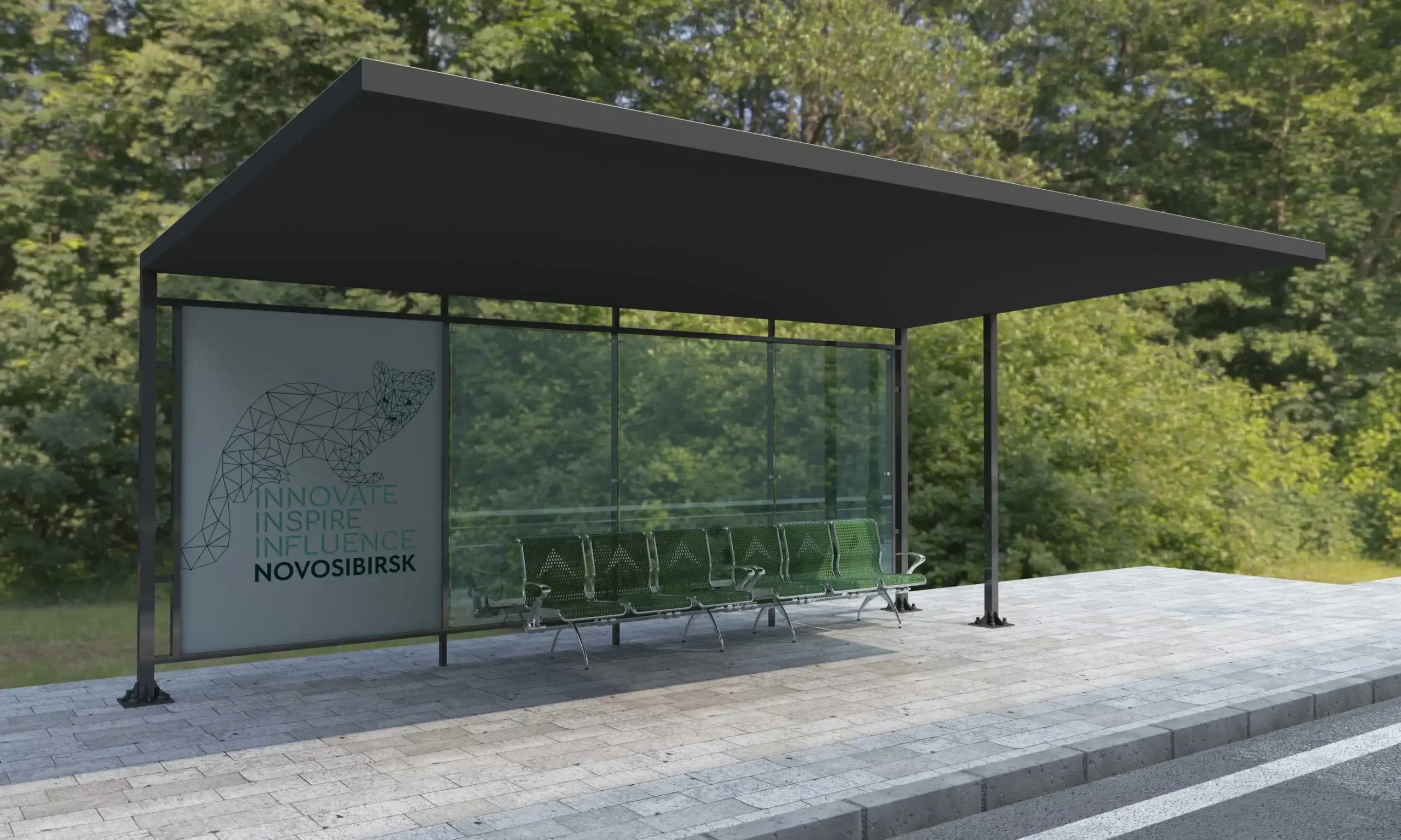
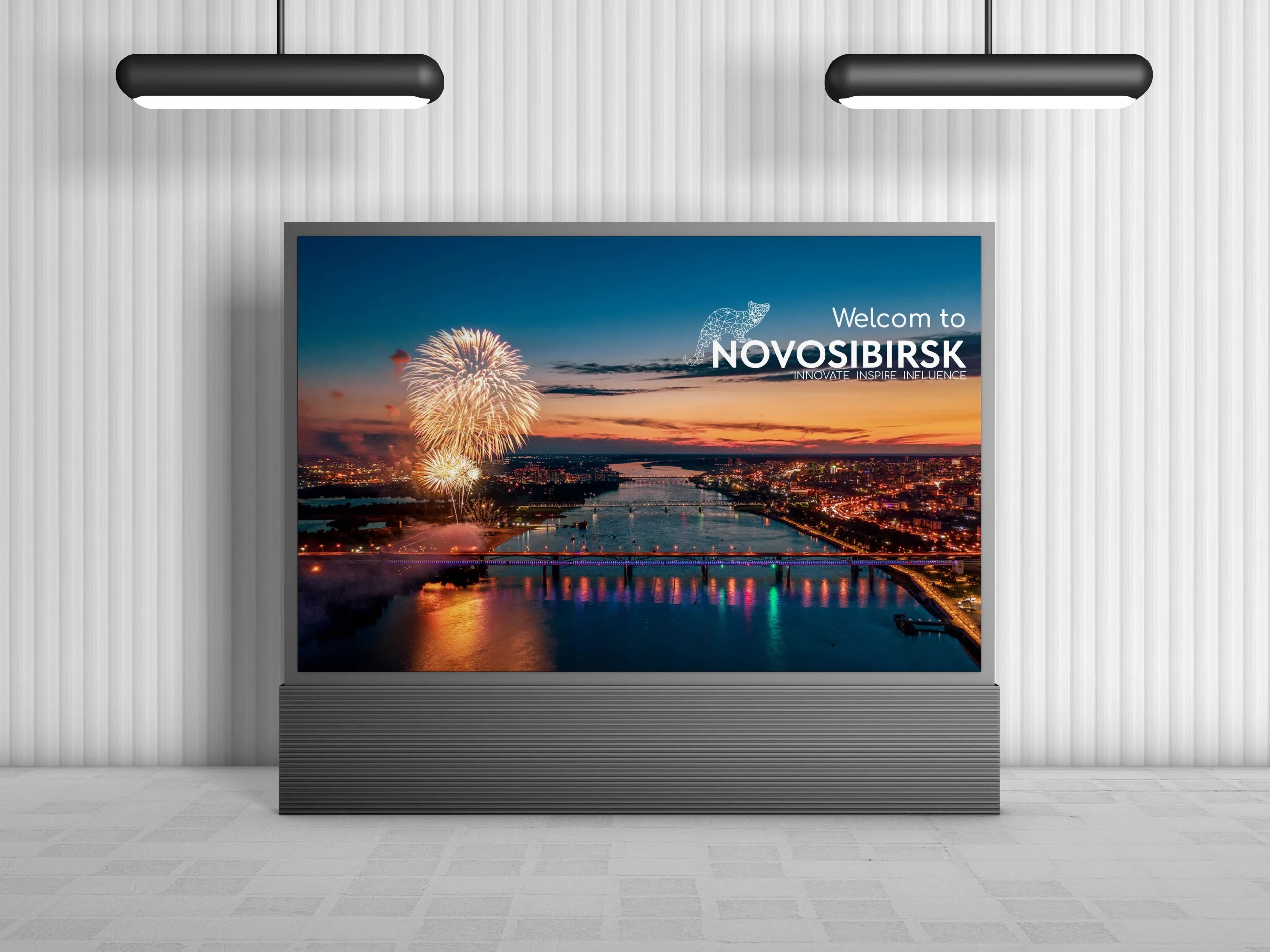
Branding applications
PROJECT OVERVIEW
Novosibirsk was founded in 1893 on the Ob River crossing point of the future Trans-Siberian Railway, where the Novosibirsk Rail Bridge was constructed.
The city rapidly grew into a major transport, commercial, and industrial hub. Novosibirsk is Russia’s scientific centre. The city hosts over 100 R&D organisations, a science campus, the General Committee of the Siberian Branch of the Russian Academy of Sciences.
Novosibirsk is inhabited by representatives of over twenty nationalities and four types of religions.
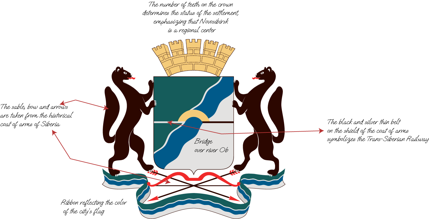
COAT OF ARMS STUDY
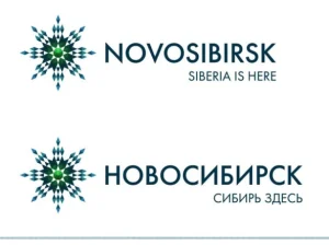
The snowflake you can see here is the logo developed for the Novosibirsk region. Even it says Novosibirsk but it is for the region branding.
The current branding system in Novosibirsk has only a coat of arms to use and doesn’t have a proper representation of the city to the visitor or people living there.
I believe that the brand can be re-designed to better represent the city of Novosibirsk and all it has to offer. The new brand has the following objectives: simplicity, be memorable: viewers should be able to remember the logo after seeing it only a few times, timeless: a logo should be able to stand the test of time.
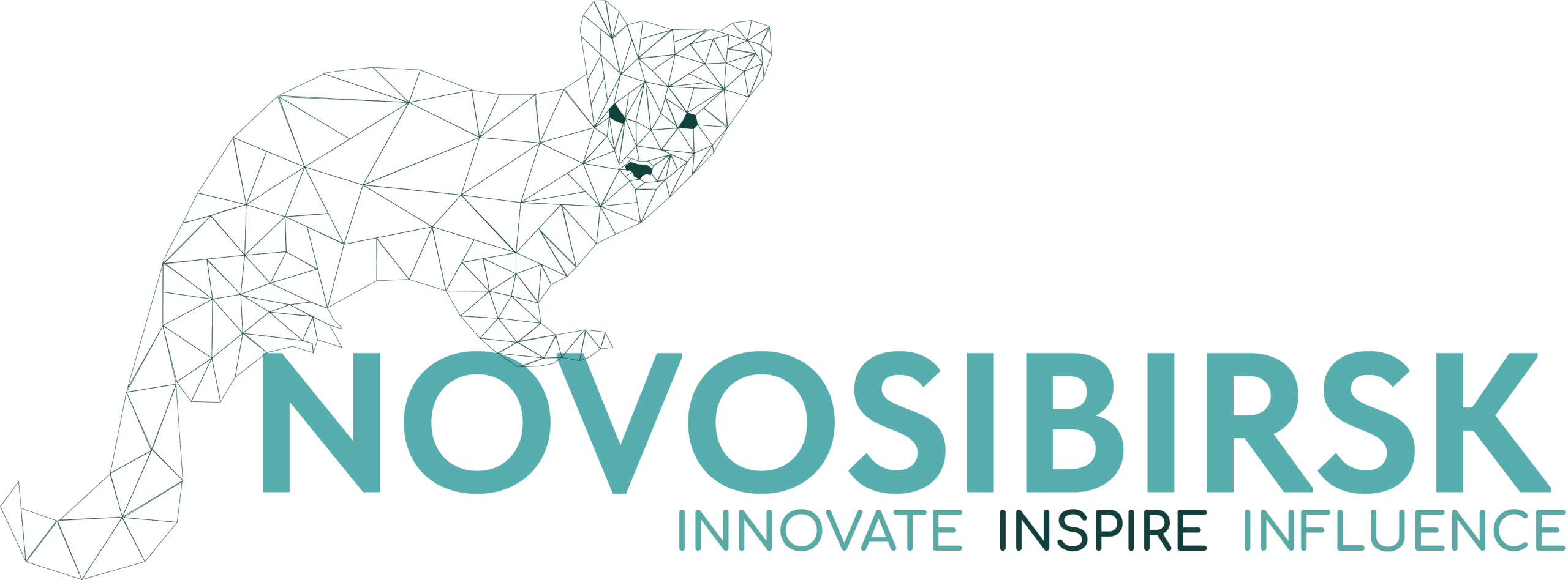
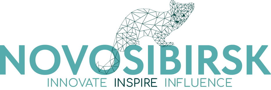
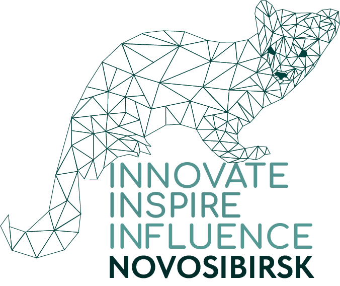
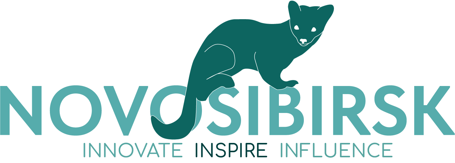
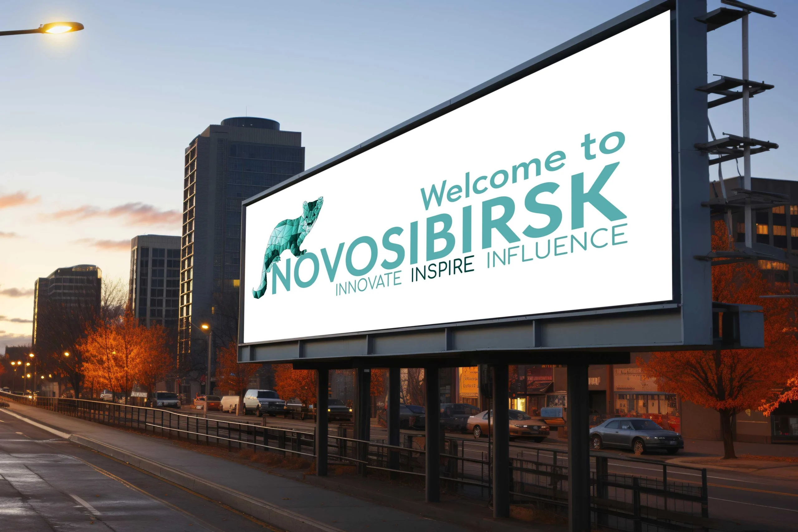
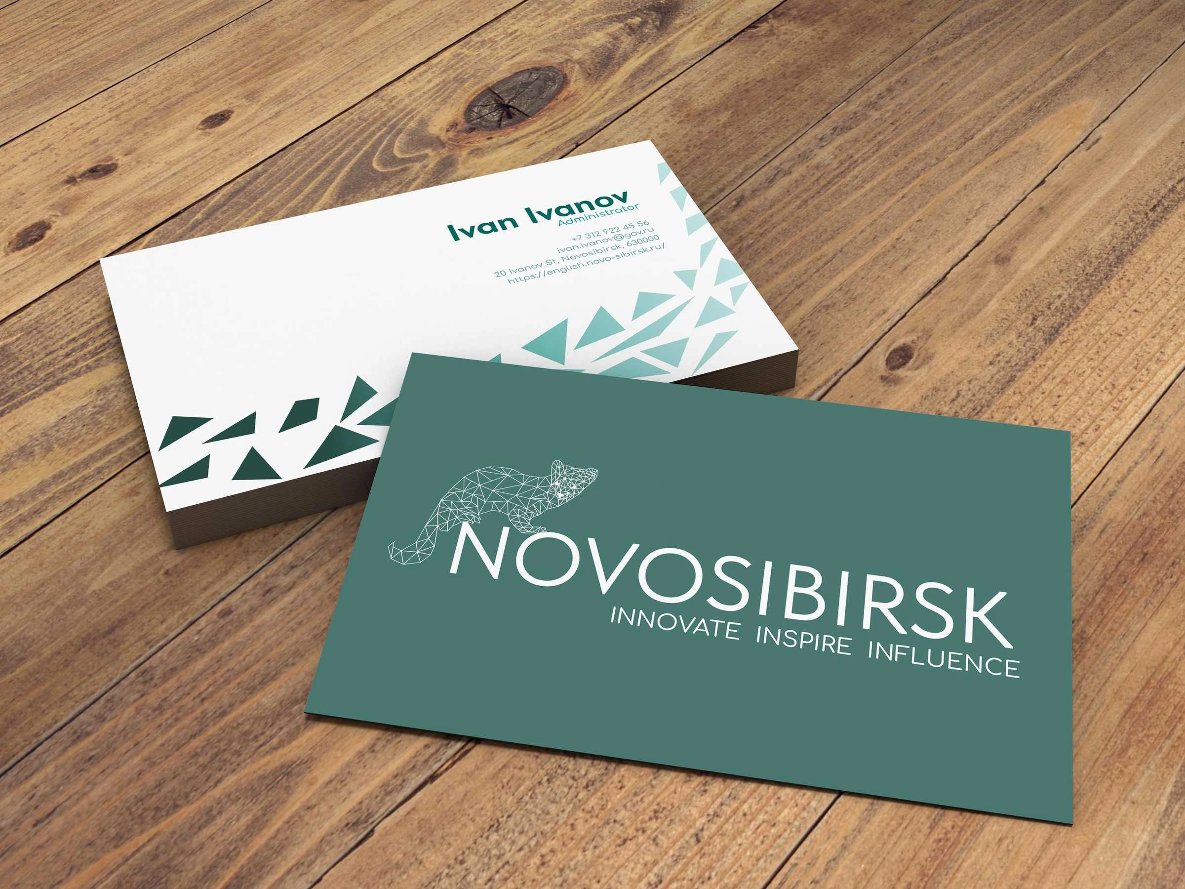
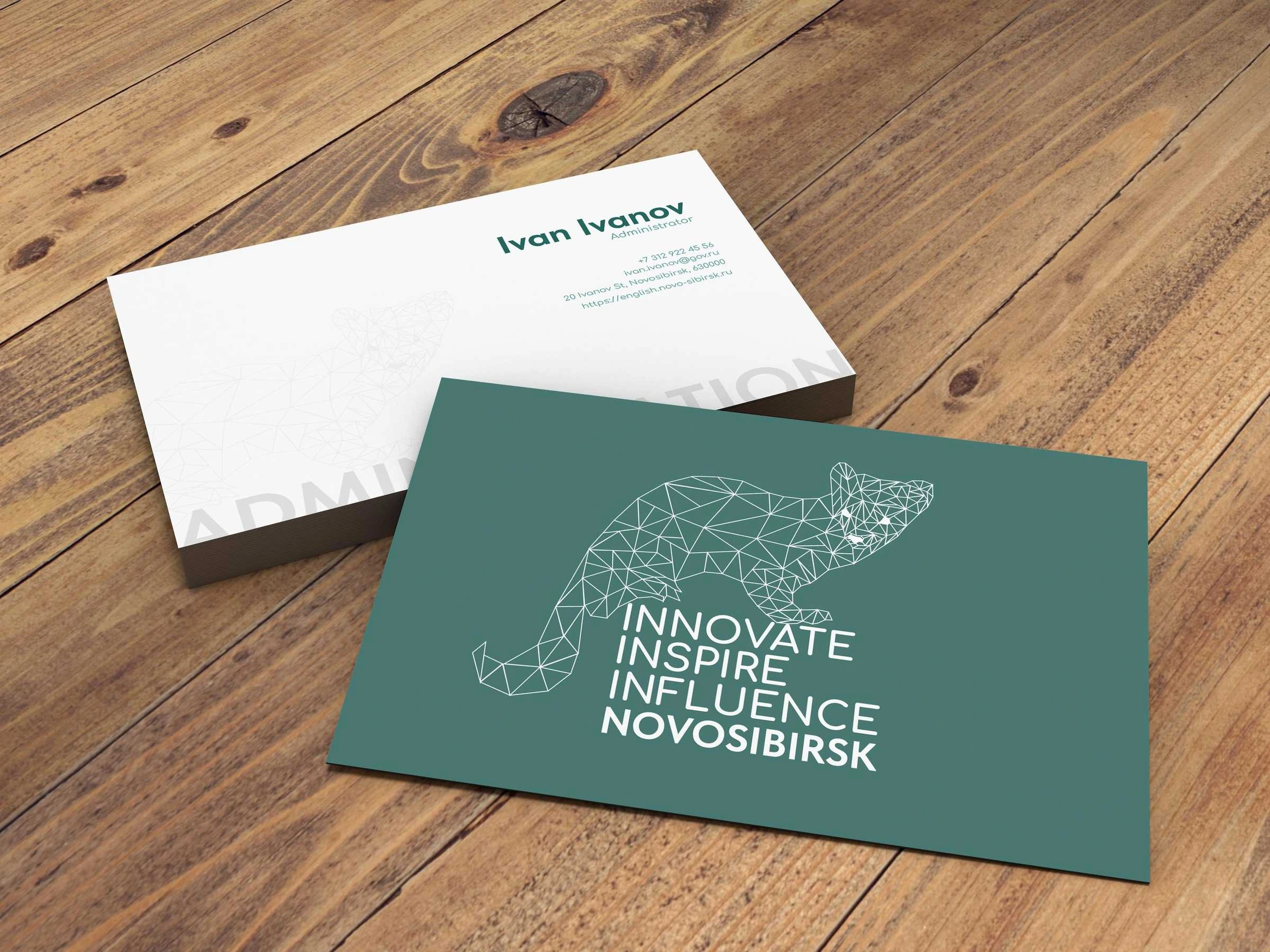
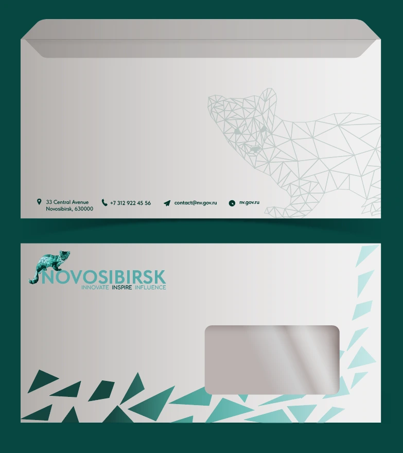
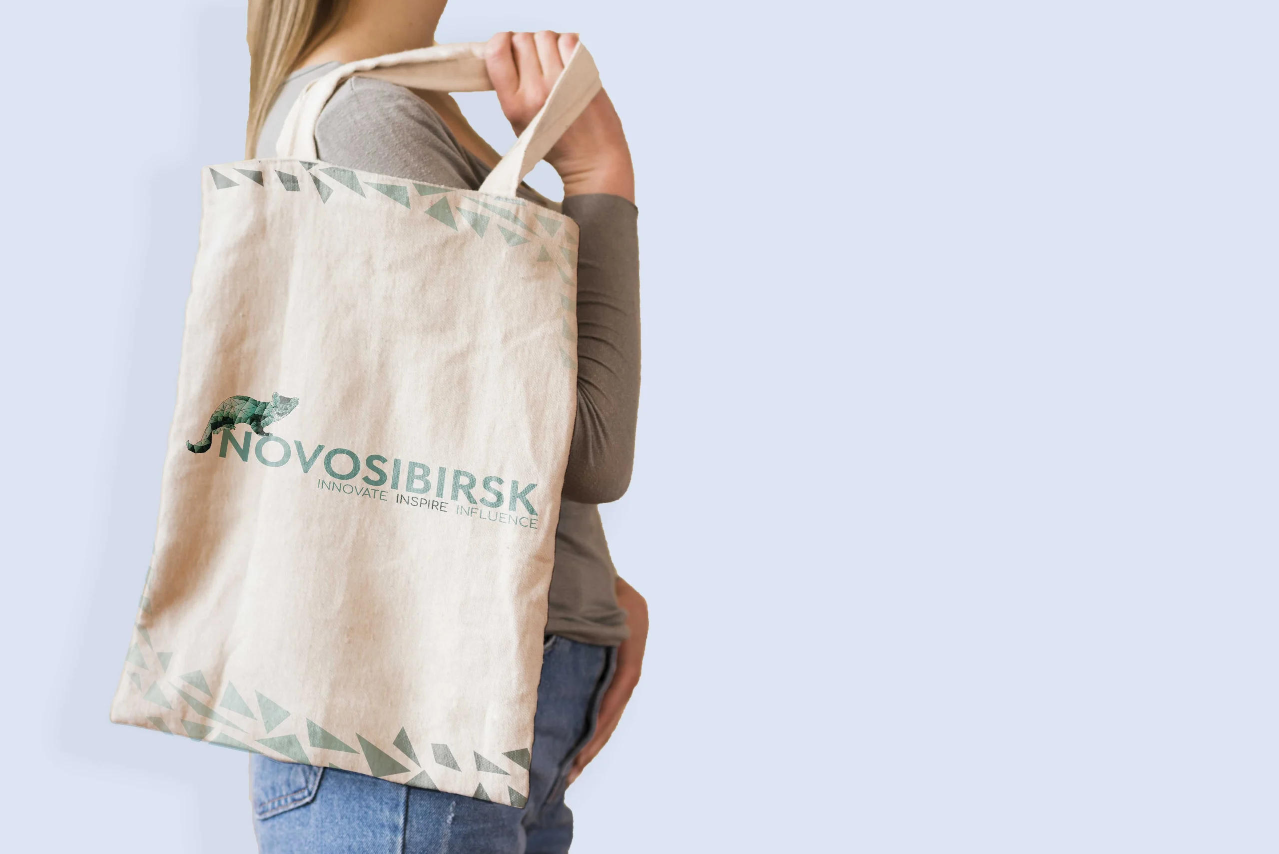
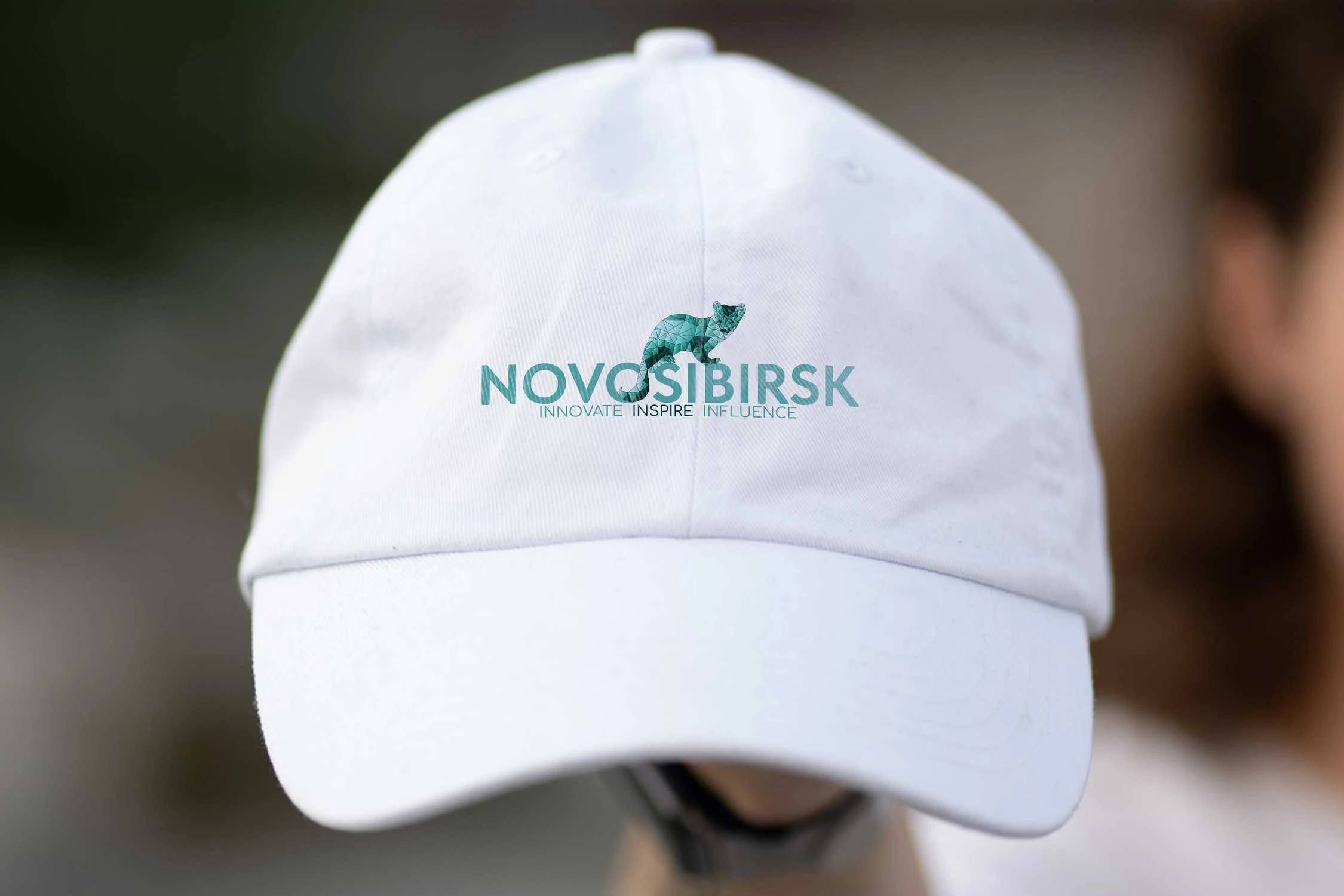
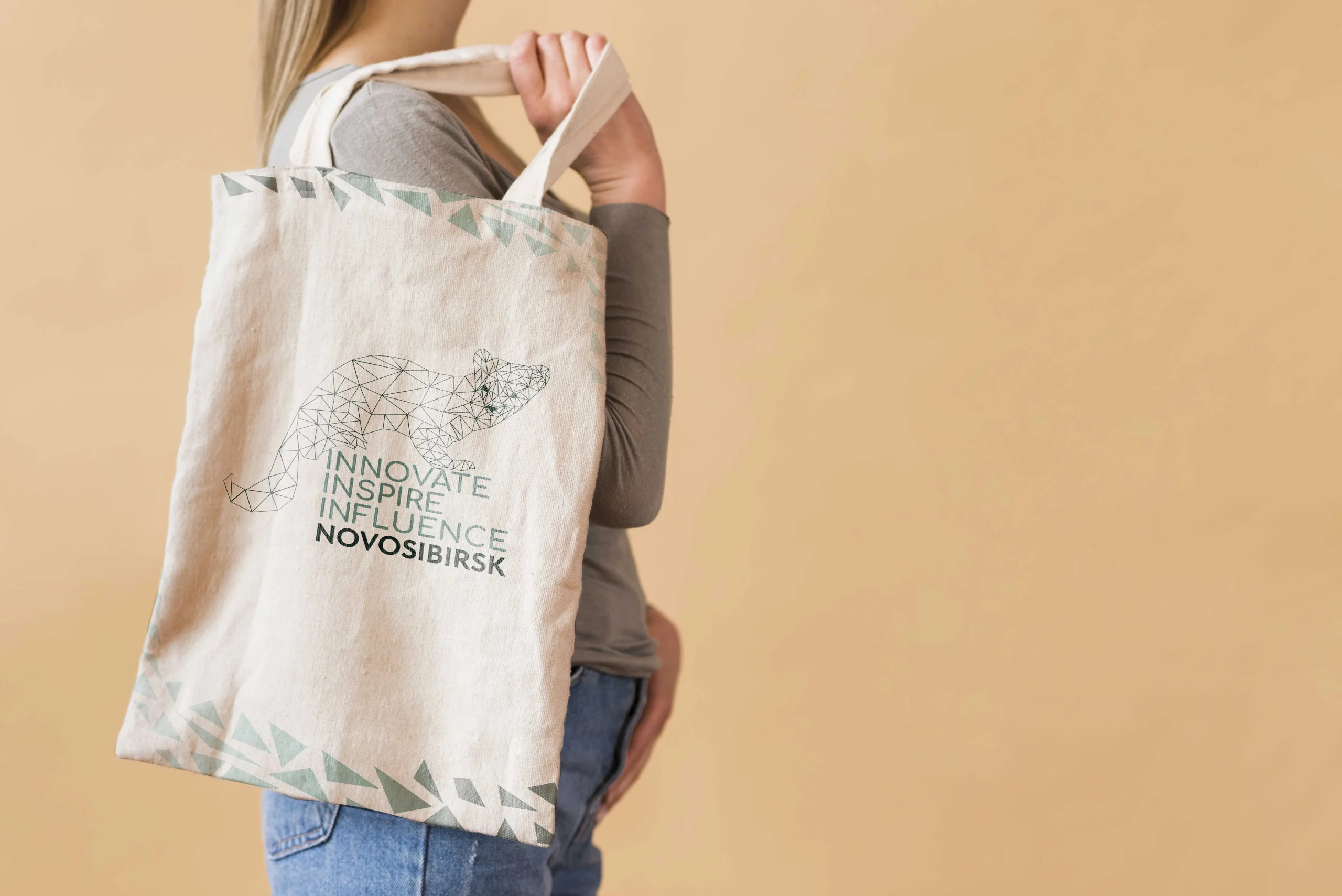
BRAND CONCEPT: THE SABLE
Brand’s tone of voice Hospitable, welcoming, traditional, friendly, respectful, joyful, inspirational.
Vision of the brand
To be recognised globally as a vibrant, inclusive city that seamlessly blends tradition with progress, becoming a beacon of scientific achievement, cultural richness, and community spirit, where people from all walks of life come together to shape a brighter future.
Why sable? The city’s identity is symbolised by the sable, a historic and cultural emblem, rendered in low-poly design to reflect the modern and diverse nature of Novosibirsk today. Each triangle in the design represents the many facets of the city’s character – its people, its history, its scientific prowess, and its cultural richness.
Single-Minded Proposition
“Innovate, Inspire, Influence” captures Novosibirsk’s unique identity as Russia’s scientific and cultural powerhouse — a city where bold ideas, creative energy, and forward-thinking progress shape everyday life. This proposition positions Novosibirsk as a place that not only grows through innovation but also inspires its people and influences the future of Siberia and beyond.
Logomark variation
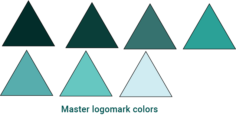
Color (main colors)+ typography system
Our colour palette is inspired by the natural and urban landscape of Novosibirsk – shades of blue for the Ob River, sky colour during different times of the year and colours of buildings in the city.